
📍 Azure Maps in Power BI — Everything You Must Know
2026 Update + Step-by-Step Demo

Power BI just changed how we visualize spatial data — big time.Bing Maps is being retired in favor of the modern Azure Maps visual, and this isn’t just a replacement — it’s a powerful upgrade for anyone doing location analytics.
Whether you’re building sales territory maps, delivery heat zones, route analytics, or operational dashboards — Azure Maps brings advanced features that simply weren’t possible before.
Prefer watching instead of reading? Here’s the complete step-by-step video walkthrough—
Retail Dataset Download for this exercise
📌 What Is Azure Maps in Power BI?
Azure Maps is the next-generation map visual built on Microsoft’s Azure Maps platform.
It replaces the older Bing Maps visuals in Power BI and gives you:
Performance for up to ~30,000 data points
Multiple map layers (marker, heat, filled, 3D columns)
Support for custom SVG markers
GeoJSON reference layers & tile layers
Real-time traffic overlays
Enhanced styling, transparency, and layering control
Azure Maps gives you both data visualization power and geo-context awareness in one place — without leaving Power BI.
Watch Demo: https://azure.microsoft.com/en-us/products/azure-maps
Samples: https://samples.azuremaps.com/
🎯 Core Layer Types You Should Know
Azure Maps organizes map visuals using multiple layers — each designed for a specific kind of visualization.
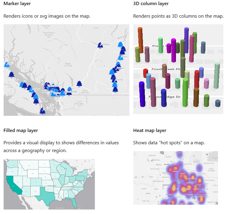
🔹 Data Rendering Layers
These show your main data points:
Marker Layer — icons or custom SVGs on the map
Bubble / 3D Column Layer — size proportional to values
Filled Map Layer — color-coded regions
Heat Map Layer — heat/spot patterns
These layers support zoom limits and ordering so you can control what shows up first as users zoom or pan.
Read More: https://learn.microsoft.com/en-us/azure/azure-maps/power-bi-visual-add-marker-layer
🔹 Context / External Data Layers
These add extra context on top of your data:
Reference Layer — overlay GeoJSON shapes (regions, outlines)
Tile Layer — custom map background tiles
Traffic Layer — real-time traffic overlay
Want to show competitor territories, sales zones, or flood risk areas? Reference layers make it possible.
🧭 Step-by-Step: Build Your First Azure Map
Here’s the workflow inside Power BI:
📍 1. Add the Azure Maps Visual
Open Power BI Desktop (May 2025 or later)
From the Visualizations pane, select the Azure Maps icon
This inserts an empty Azure Maps canvas
📍 2. Add Your Spatial Data
Drag fields into these map buckets:
The Location field is used for addresses or geographic names, while Latitude and Longitude allow you to plot precise coordinates. The Legend categorises data using different colours or icons, Size scales markers based on measures like sales, and Tooltips display additional details when users hover over a data point.
📍 3. Enable and Customize the Marker Layer
Azure Maps Marker layer lets you plot locations using built-in icons or SVG images.
✔ Change marker type (Icon vs Image)
✔ Bind an SVG per data point using conditional formatting
✔ Size, color, transparency control
✔ Rotation (great for showing direction / routes)
💡 Pro tip: Use SVG markers to show brands, logos, or custom shapes like bridges, vehicles, or status icons.
📍 4. Styling & Map Settings
Under Format → Map settings, you can toggle:
Labels on/off
Road details
Borders (country, state)
Satellite vs road map styles
This lets you switch between clean analytic maps and rich contextual maps depending on your story.
🎨 How SVG Markers Make Your Map Come Alive
Azure Maps doesn’t just let you use dots — you can use full SVG graphics. This means:
Brand logos
Custom icons
Animated shapes
Even flight or vehicle routes
SVG markers are crisp at any zoom level because they’re vector graphics — not pixel images.
One of the example used in the video: To Create BMW logo:
<svg role=”img” viewBox=”0 0 100 100” xmlns=”http://www.w3.org/2000/svg”>

  <title>BMW</title>

  <!-- Outer black ring -->

  <circle cx=”50” cy=”50” r=”49” fill=”#1a1a1a”/>

  <!-- White separator ring -->

  <circle cx=”50” cy=”50” r=”42” fill=”white”/>

  <!-- Inner black ring background -->

  <circle cx=”50” cy=”50” r=”38” fill=”#1a1a1a”/>

  <!-- Blue top-right quadrant -->

  <path d=”M50 12 A38 38 0 0 1 88 50 L50 50 Z” fill=”#0066CC”/>

  <!-- White bottom-right quadrant -->

  <path d=”M88 50 A38 38 0 0 1 50 88 L50 50 Z” fill=”white”/>

  <!-- Blue bottom-left quadrant -->

  <path d=”M50 88 A38 38 0 0 1 12 50 L50 50 Z” fill=”#0066CC”/>

  <!-- White top-left quadrant -->

  <path d=”M12 50 A38 38 0 0 1 50 12 L50 50 Z” fill=”white”/>

  <!-- Inner white divider lines -->

  <line x1=”50” y1=”12” x2=”50” y2=”88” stroke=”white” stroke-width=”1.5”/>

  <line x1=”12” y1=”50” x2=”88” y2=”50” stroke=”white” stroke-width=”1.5”/>

  <!-- Inner circle border -->

  <circle cx=”50” cy=”50” r=”38” fill=”none” stroke=”white” stroke-width=”1.5”/>

  <!-- Outer ring inner border -->

  <circle cx=”50” cy=”50” r=”42” fill=”none” stroke=”#1a1a1a” stroke-width=”0.5”/>

  <!-- Outermost border -->

  <circle cx=”50” cy=”50” r=”49” fill=”none” stroke=”#1a1a1a” stroke-width=”1”/>

</svg>
📊 Real World Examples You Can Build
Retail Sales Dashboard
Plot store sales with bubble sizes
Color by category
Custom brand SVG icons
Fleet or Delivery Visual
Show routes
Rotate vehicle SVGs based on heading
Traffic layer to show congestion
Regional Risk Visualization
Overlay GeoJSON reference shapes
Use tile layer to add custom imagery
Visualize hotspots and regions
Plus, Microsoft and community examples show how Azure Maps can help you uncover insights others miss.
Hope you enjoyed this week’s newsletter. I regularly share insights on Power BI and the evolving world of AI.
Stay analytical. Stay curious.
Atikant Jain
Your Analytical Guy
admin@analyticalguy.tech