Mastering the Art of Matrix Visuals in Microsoft Power BI
Data Visualization Series
🙋♂️Hi there. I am Atikant Jain (AJ). Welcome to my newsletter, where I talk about career in Analytics & Data Science. Currently spreading love about Microsoft Power BI & Microsoft Fabric.
📊 Introduction to Matrix Visual
Matrix visuals are a game-changer when it comes to presenting data in a structured and interactive way. Whether you're a beginner or a seasoned Power BI user, there's always room to enhance your visuals to impress clients and uncover actionable insights.
In this post, I’ll walk you through how to take your Matrix Visuals to the next level, summarizing the highlights from my latest YouTube video.
You can also watch the video on YouTube:
1. The Basics: Building a Matrix Visual
Matrix visuals are foundational tools in Power BI for presenting structured data. Start with the essentials:
Learn how to set up rows, columns, and values to display your data clearly.
Understand how the Matrix Visual differs from simple tables, offering capabilities like subtotals, hierarchies, and cross-highlighting.
Pro Tip: Use hierarchies to drill down into your data, enabling readers to explore finer details effortlessly.
2. Enhancing Readability: Formatting and Layout
A polished Matrix Visual speaks volumes. Focus on:
Grid Customization: Adjust column widths and gridlines for balance and clarity.
Font Styling: Choose appropriate font sizes and styles for better readability.
Alternating Row Colors: Add contrast to make data rows pop.
Impactful Tip: Enable Word Wrap for headers to avoid truncated text, ensuring clarity in all device views.
3. Driving Insights with Conditional Formatting
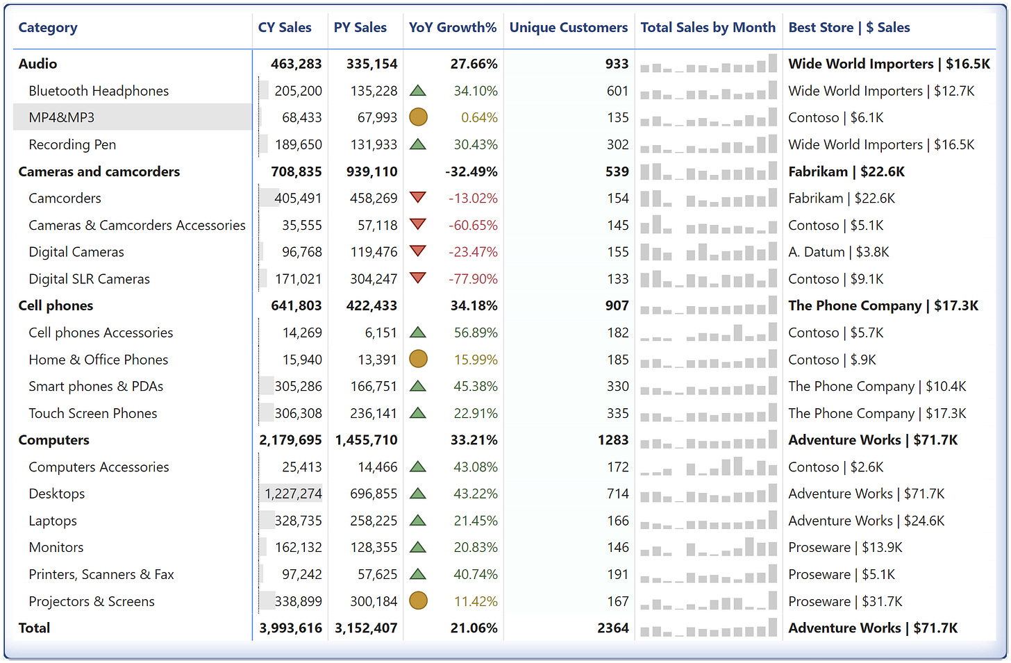
Make your data come alive by adding visual cues:
Use color scales to highlight trends, such as sales growth or decline.
Add icons for quick identification of key metrics (e.g., green for profit, red for loss).
Incorporate data bars for instant comparisons within the matrix.
Why It Matters: Conditional formatting guides your audience to insights without overwhelming them with raw numbers.
4. Advanced Tricks: Make It Dynamic and Interactive
Take your Matrix Visuals to the next level:
Use slicers to let users filter data in real-time.
Add dynamic measures to display KPIs that adjust based on user selections.
Create tooltips to provide context or additional insights when users hover over data points.
Client-Winning Tip: Add a dynamic title using DAX to reflect filtered values, making your report feel personalized.
Learn POWER QUERY for career growth:
Please write to admin@analyticalguy.tech if there’s anything you would like to share with us.


