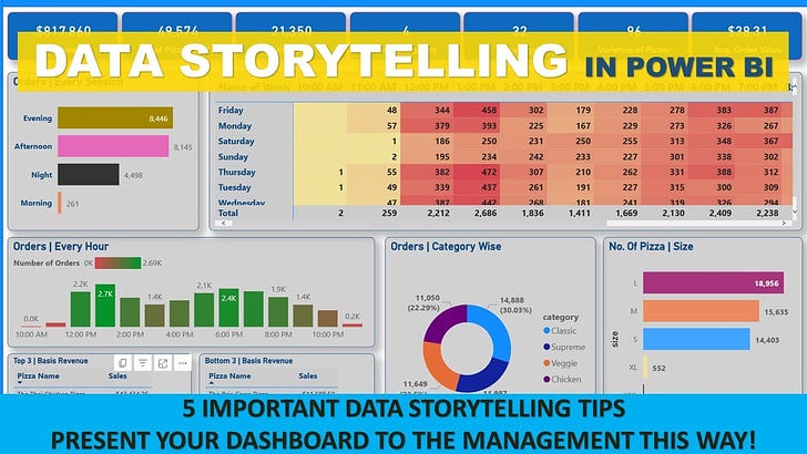
In today's data-driven world, numbers and metrics are everywhere. However, raw data alone is often not enough to inspire change or make critical business decisions. Enter data storytelling—the art of weaving data and analytics into a compelling narrative. When done effectively, it transforms complex datasets into actionable insights that resonate with your audience. Power BI, a powerful business intelligence tool, plays a pivotal role in this process, offering intuitive visualizations and interactive features that enhance the storytelling experience.
What is Data Storytelling?
At its core, data storytelling is about translating complex data into a story that is both engaging and informative. It's not just about presenting numbers or creating visuals; it's about crafting a narrative that guides your audience through the data, helping them understand the underlying insights and prompting them to take action.
Why Data Storytelling Matters
While charts, graphs, and dashboards are valuable, they often lack the human element that makes information relatable. Data storytelling bridges this gap by adding context, emotion, and a clear message. Here’s why it’s essential:
Simplifies Complexity: Data storytelling helps break down complex information into digestible insights, making it easier for the audience to understand.
Drives Engagement: A well-crafted story captures the audience's attention, keeping them engaged and invested in the insights being presented.
Facilitates Decision-Making: By highlighting key data points and trends, data storytelling helps decision-makers focus on what truly matters.
Using Power BI to Enhance Your Data Storytelling
Power BI is more than just a data visualization tool; it's a storytelling platform. It allows you to turn raw data into dynamic and interactive reports that tell a story. Here’s how you can leverage Power BI for effective data storytelling:
1. Building a Narrative with Data
A good story has a beginning, middle, and end. In the context of data storytelling, this translates to:
Beginning: Define the context and introduce the key question or problem.
Middle: Use visuals to show the data trends, patterns, and insights.
End: Conclude with actionable insights or recommendations.
In Power BI, you can structure your report pages to reflect this flow. For example, start with an overview page that sets the stage, followed by detailed pages that delve into specific insights, and conclude with a summary that ties everything together.
2. Creating Compelling Visuals
Power BI offers a wide range of visualizations, from simple bar charts to complex scatter plots. The key to effective storytelling is choosing the right visual that best represents the data:
Bar and Column Charts: Great for comparing categories and showing trends over time.
Line Charts: Ideal for illustrating trends and changes over time.
Pie and Donut Charts: Useful for showing proportions but should be used sparingly.
Maps: Excellent for geographical data to show location-based insights.
Custom Visuals: Power BI’s marketplace offers a variety of custom visuals that can enhance your storytelling.
Ensure that your visuals are clear, concise, and not overly complex. The goal is to enhance the narrative, not to overwhelm the audience with too many details.
3. Interactivity for Deeper Insights
One of Power BI's strengths is its interactivity. You can add slicers, filters, and drill-through features to allow users to explore the data at their own pace. This interactive storytelling lets your audience dive deeper into the areas of the story that are most relevant to them.
For example, if you're telling a story about sales performance, you can use slicers to let the audience filter by region, product, or time period. Drill-through actions can provide a more detailed view, allowing users to explore the underlying data behind high-level trends.
4. Adding Context with Annotations and Narratives
Incorporate text boxes, tooltips, and annotations to guide the audience through your story. In Power BI, you can use:
Text Boxes: To provide context, explain visuals, and highlight key insights.
Tooltips: To show additional information when users hover over a visual.
Annotations: To draw attention to specific data points, such as a spike in sales or an outlier.
These elements act like a narrator, helping to explain the 'what,' 'why,' and 'how' of the data.
5. Using Themes and Consistent Design
A consistent design helps to create a cohesive narrative. Power BI allows you to apply themes to standardize colors, fonts, and styles across your report. This consistency not only makes your report visually appealing but also ensures that the audience focuses on the story rather than being distracted by inconsistent visuals.
Best Practices for Data Storytelling in Power BI
To craft an effective data story, keep these best practices in mind:
Know Your Audience: Tailor your narrative and visuals to the audience's level of understanding and their needs.
Focus on Key Insights: Highlight the most critical insights that drive the narrative. Avoid cluttering the story with unnecessary details.
Keep It Simple: Complexity can overwhelm your audience. Use clear visuals and straightforward language.
Test Your Story: Before presenting, test your story with a sample audience to ensure it’s engaging and easy to understand.
Iterate and Improve: Data storytelling is an iterative process. Gather feedback and make improvements to enhance the narrative.
Conclusion
Data storytelling is a powerful way to turn data into a narrative that informs and inspires action. Power BI, with its robust visualization and interactivity features, is an excellent tool for crafting compelling data stories. By building a narrative, choosing the right visuals, and adding interactivity and context, you can transform complex data into insights that drive informed decision-making.


